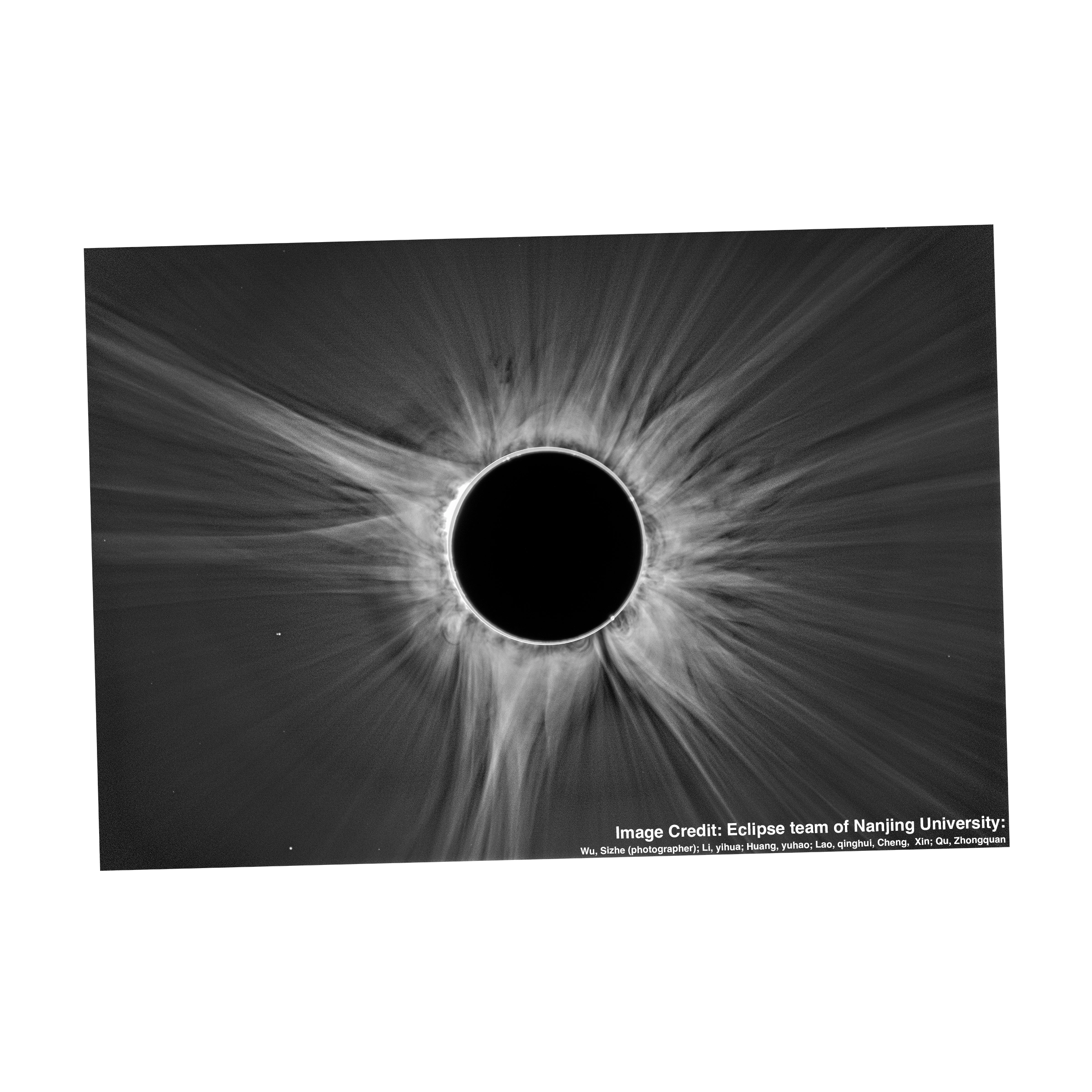
Photo By: Eclipse Team of Nanjing University
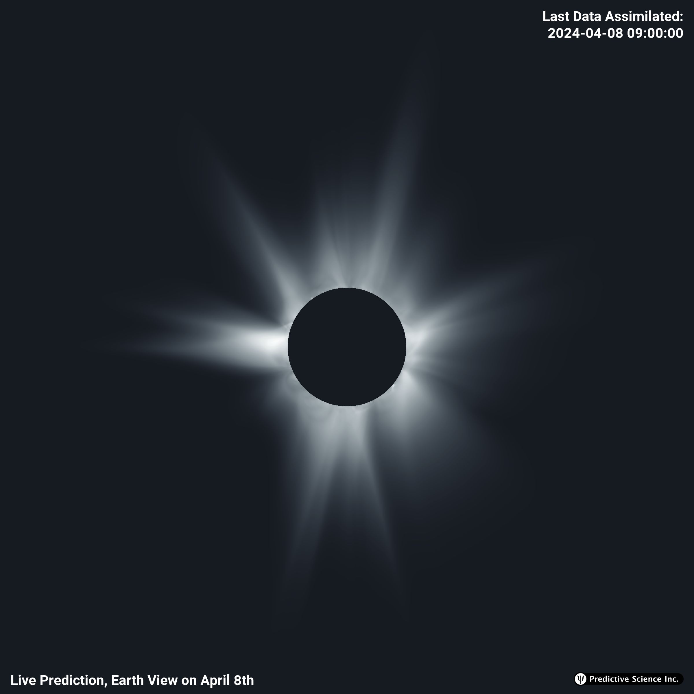
Now that April 8th has come and gone, we have the opportunity to compare our prediction to various
photographs taken of the corona during totality. Because the way in which the images are processed
determines what features one sees, we include several different types of images for this comparison. Each
photo has been carefully aligned and sized to match the field of view and orientation of our prediction
imagery. Note: the position of the moon is different in each photo.
Check out the widget above to try out some comparisons, this page is best viewed in a non-mobile browser. Use the opacity slider to fade the overlaid photograph in and out. Use the selection boxes to choose which photo is displayed and/or which image from the prediction is displayed. To blink the images, hold the “b” key on your keyboard. Select the “Movie” checkbox to see how the prediction changed over time. Select the “Color Filter” option to blend the images in different color channels (white: overlap, purple: simulation, green: observation). Use the arrow keys to change the current image time by 6 hours. Hold shift while using the arrow keys to change the current time of the image by 12 hours
In the spirit of prediction we show the last output of the simulation prior to totality by default, which is time-stamped at 9 UT on April 8th (9 hrs, 45 mins behind real time). Since then, we have run the simulation slightly farther ahead in time in order to assimilate some of the new regions that were just rotating into view on the East (left) limb. Use the date picker to see how we could have done if there was a magnetograph with a perspective leading Earth (e.g.ESA’s VIGIL mission, which will sit at the L5 Lagrange point).